Getting Started
Creating your first card
Step 1 — Open the Card Designer
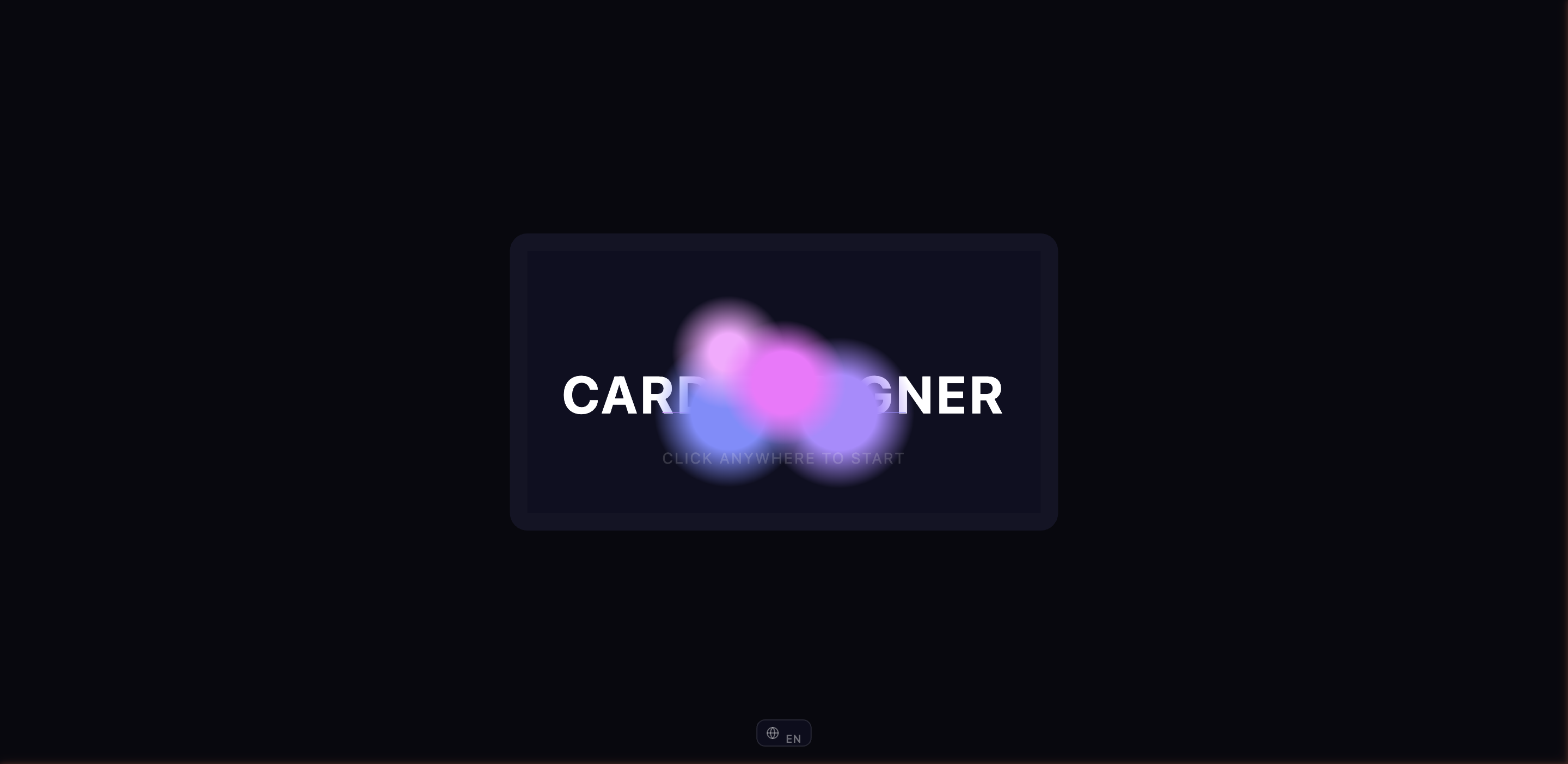
Go to https://alpha.elysium.ar. You'll land on a welcome screen with a glassy card animation.
You have three ways to get going:
- Sign in — If you already have an ELYSIUM account
- Create an account — Walks you through a quick sign-up flow
- Start a new project — Jump straight into the designer (no account needed)
If you have a saved design from a previous session, you can also drag and drop a .ecard file directly onto the landing page to pick up where you left off.
You don't need to sign in immediately. Many people prefer to design first and create an account later when they want to save to the cloud.
Step 2 — Set up your project
The Card Designer is a templating system: a single project (think of it as your "world") can hold one or more reusable cards inside it. The setup wizard walks you through six steps to create that first card:
-
Start new or load saved — Begin fresh or resume from a saved
.ecardfile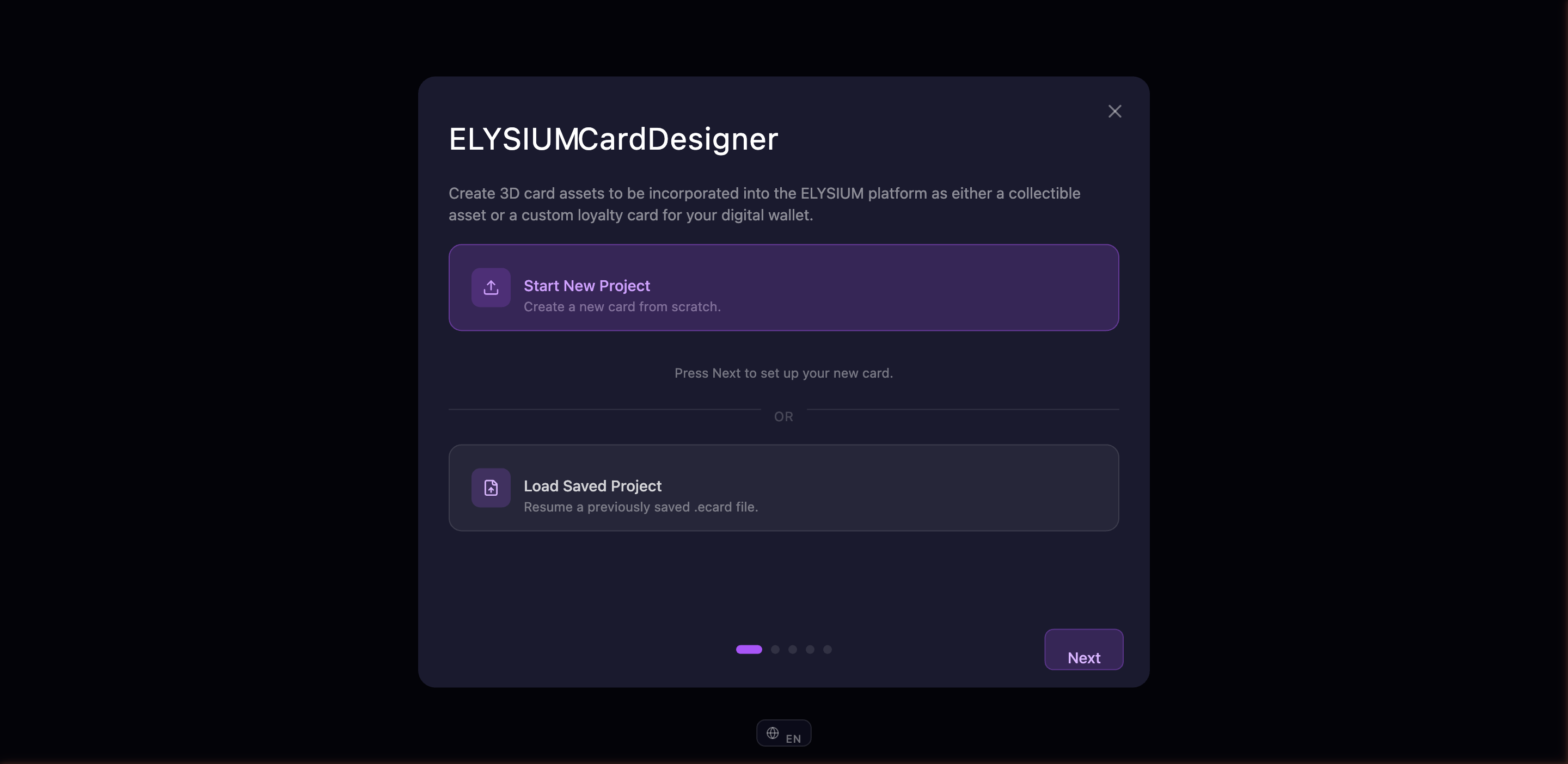
-
Name your project — Give your "world" a memorable name. This is the larger container that can hold multiple cards (so don't make it the same as your card title).
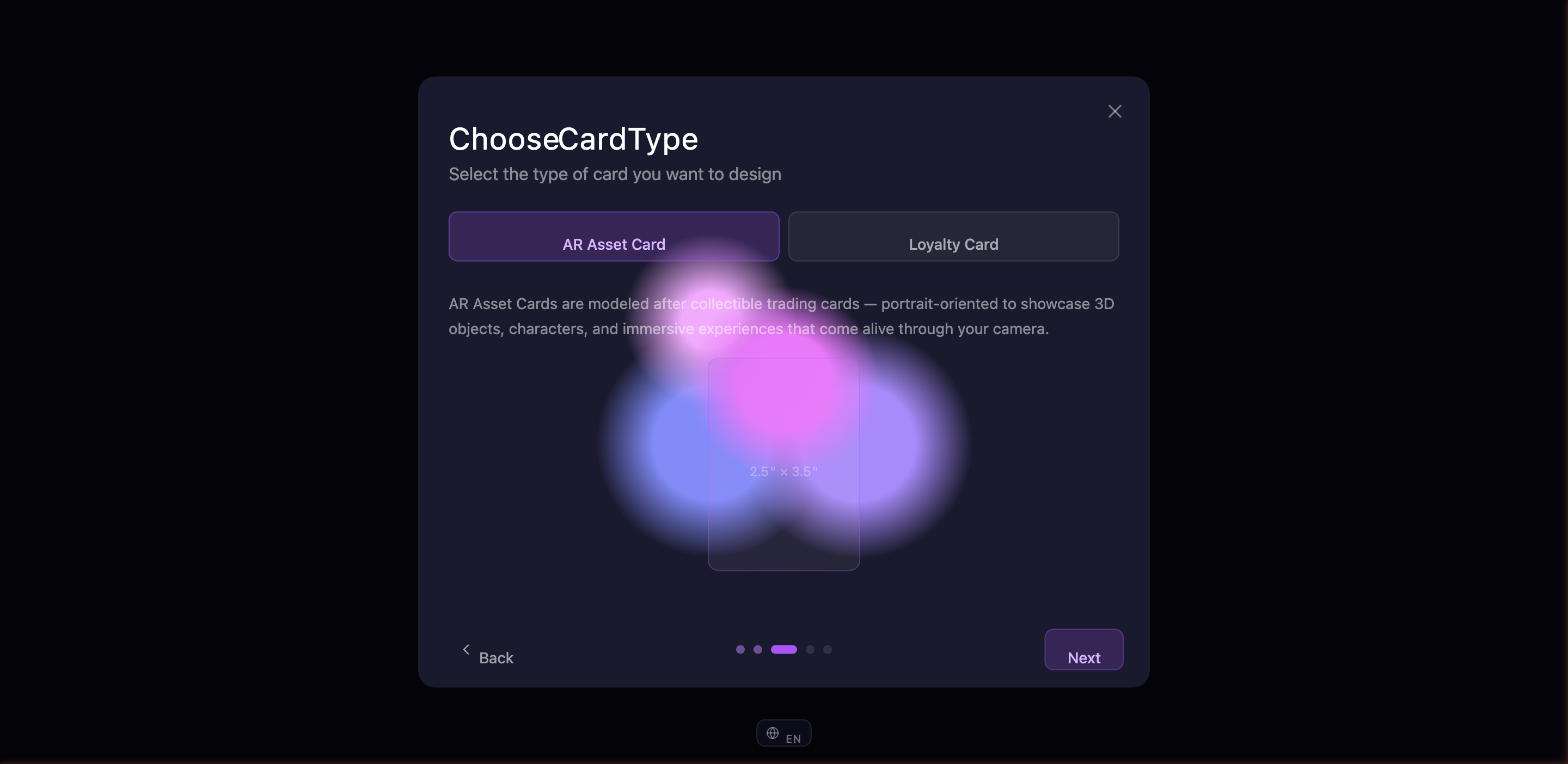
-
Pick your card type — AR Card or Loyalty Card. The wizard shows a live preview of the card shape and dimensions:
- AR Card — Portrait playing-card form factor (like a tarot, magic, or profile card)
- Loyalty Card — Landscape credit-card form factor (like a discount or membership card)
The two types have different content fields available later, but they share the same designer.
-
Name your card — The unique title for the first card in your project
-
Add a description — A short note about this card (also used as a default collection label)
-
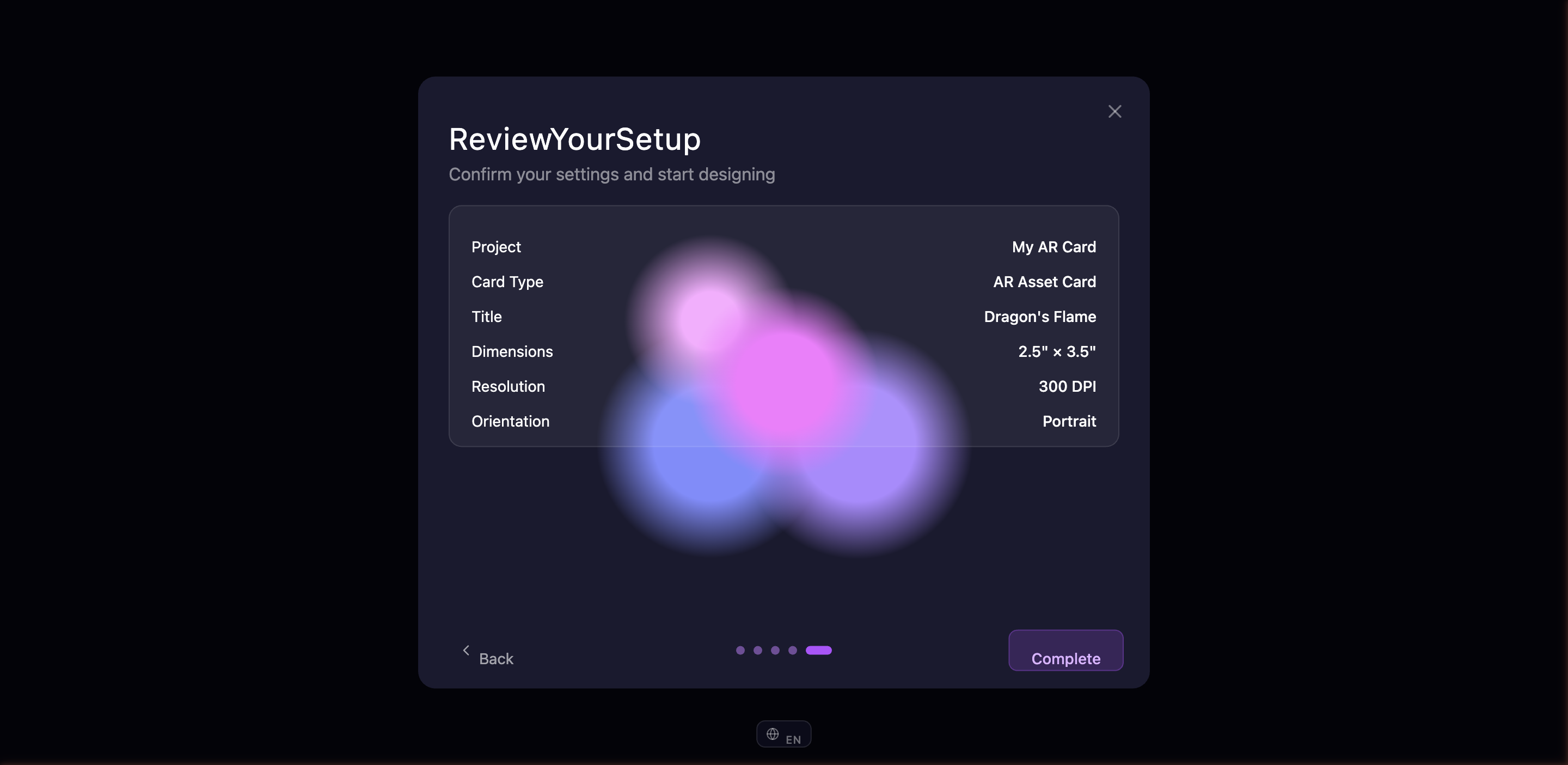
Review — Double-check everything you've entered. If something needs fixing, navigate back to that step. Otherwise hit "Start Designing".
Step 3 — Newsletter (optional)
Before the workspace opens, you may be offered the chance to sign up for the ELYSIUM newsletter to hear about new features and tools as they ship. You can skip this step or fill it out — you'll go straight to the workspace either way.

That's it — you're in the workspace.
The workspace at a glance
The workspace has three main areas:
| Area | What's there |
|---|---|
| Left panel | Your images, camera angles, backgrounds, and card content |
| Center canvas | A live 3D preview of your card that updates as you make changes |
| Right panel | Material finishes, lighting, visual effects, export, projects, and privacy settings |
You can collapse either side panel by clicking the toggle on its inner edge — handy when you want a bigger preview.
A floating toolbar at the bottom of the canvas gives you quick access to camera reset, grid toggle, screenshots, and card flip.
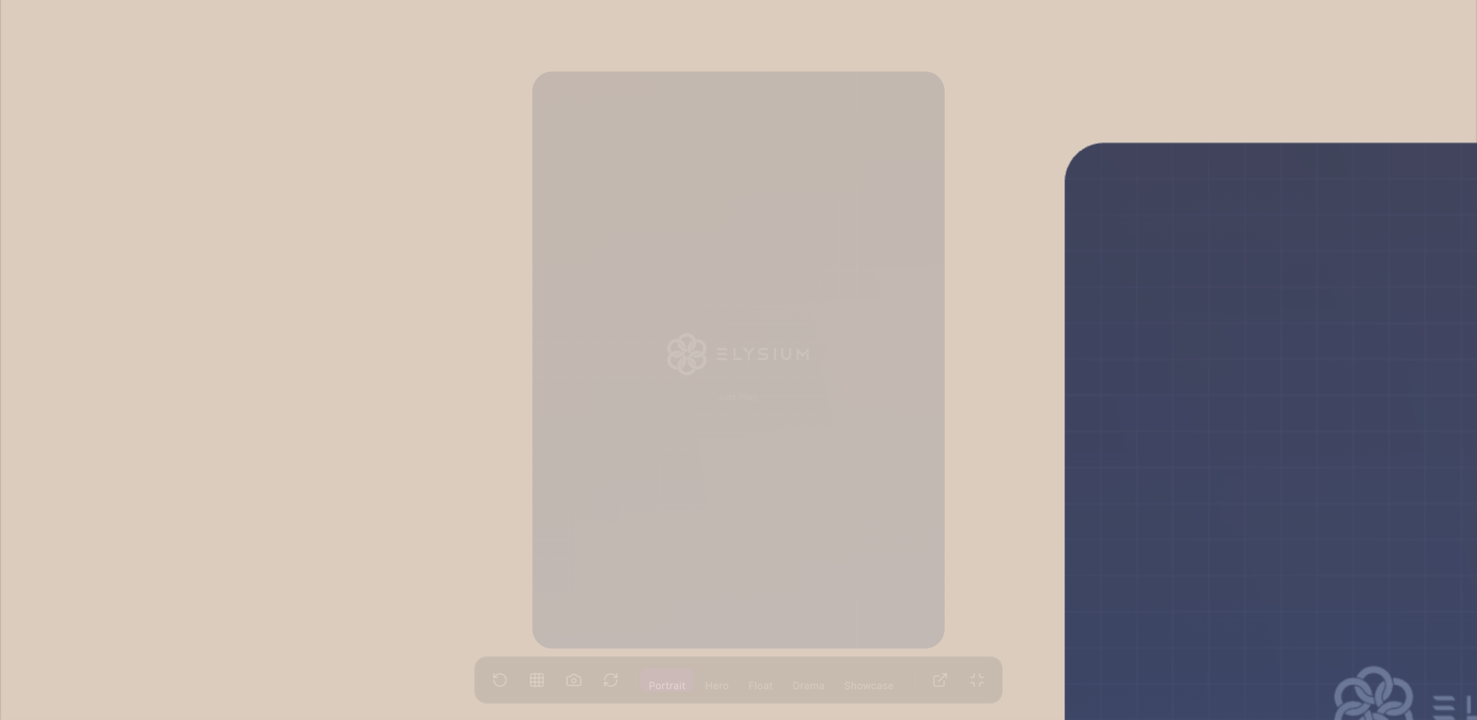
Camera angles
Five camera presets let you view your card from different angles. Switch between them by clicking the preset buttons or pressing keys 1 through 5:
| Key | Preset | What it looks like |
|---|---|---|
| 1 | Portrait | Close-up front view |
| 2 | Hero | Straight-on showcase (default) |
| 3 | Float | Three-quarter floating angle |
| 4 | Drama | Low-angle dramatic shot |
| 5 | Showcase | Gallery view with front and back preview |
You can also orbit freely by clicking and dragging on the canvas, zoom with your scroll wheel, and pan with a right-click drag.
Flipping your card
Your card has two sides. To flip between front and back:
- Press F on your keyboard
- Double-click anywhere on the canvas
- Click the flip button in the floating toolbar
Fullscreen preview
Click the expand icon at the right end of the floating toolbar to enter fullscreen preview mode. This hides the side panels and lets you see your card in all its glory. If you've attached audio, it will play automatically.
Press Esc or click the minimize button to go back to the workspace.