Images, Backgrounds, and Stickers
Adding images to your card
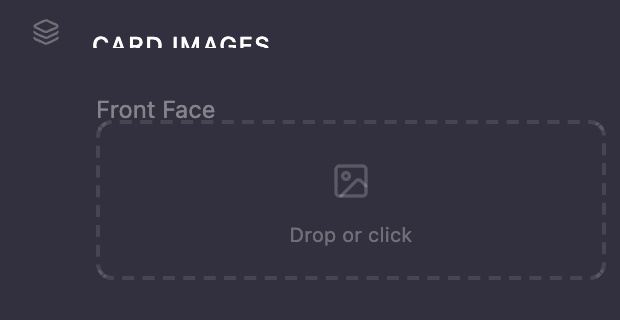
Drag and drop images directly onto the labeled zones in the left panel:
- Front BG — The full background image on the front of your card
- Front FG — An overlay image (your logo, character art, etc.) that sits on top of the background
- Back Face — The image for the back of your card
- Brand Logo — (Loyalty cards only) Your brand logo
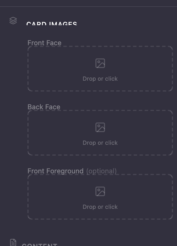
Watch for the purple highlight when dragging an image over a drop zone — that means it's ready to accept your file.
After uploading a foreground image, use the offset and scale sliders to position and size it exactly how you want.

Supported formats: JPEG, PNG, and WebP.
Picking a background
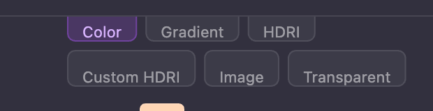
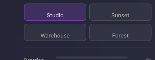
The background picker in the left panel gives you several options:
-
Color — A solid color with opacity control
-
Gradient — Two-color gradient with angle and opacity
-
HDRI Preset — Choose from Studio, Sunset, Warehouse, or Forest environments for realistic reflections
-
HDRI Custom — Upload your own
.hdror.exrenvironment file -
Image — Use any image as a flat backdrop
-
Transparent — No background (useful for exporting clean cutouts)
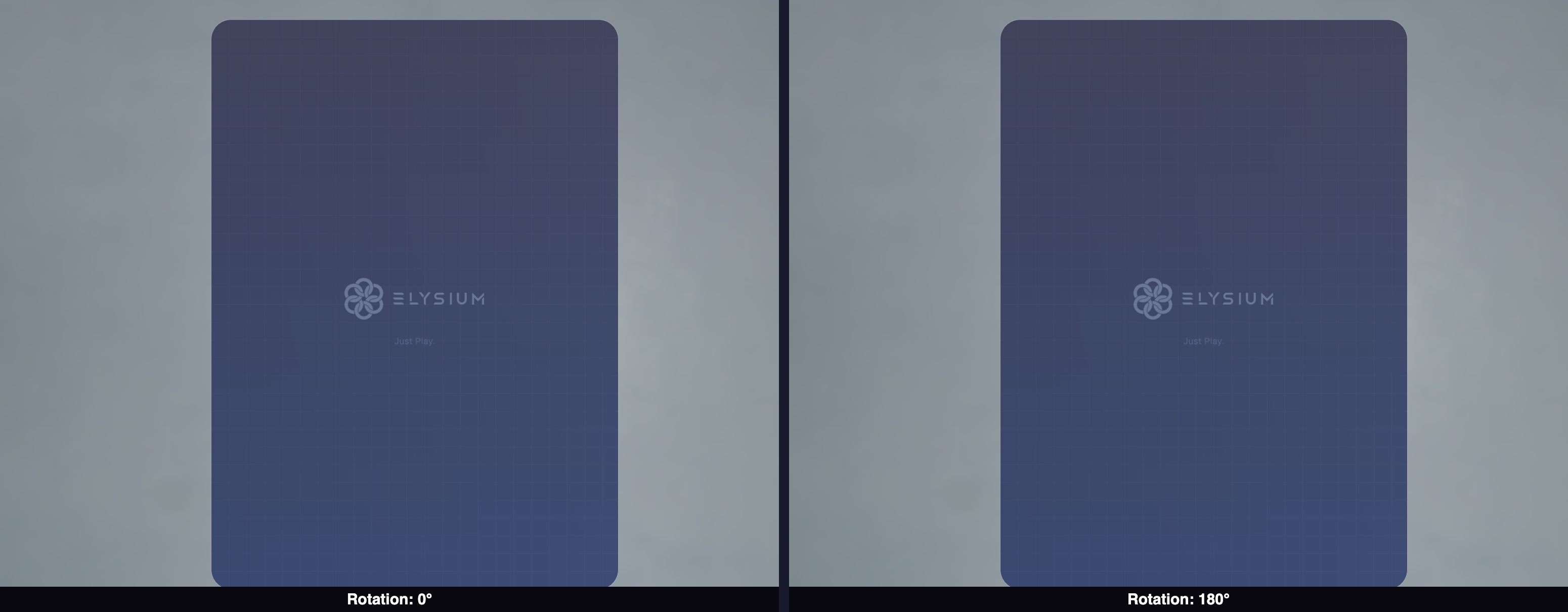
When using an HDRI background, a Rotation slider lets you spin the environment around to position light sources and reflections exactly where you want them.
Adding gradients
Both card types support gradient overlays on the front and back faces. In the content editor section of the left panel:
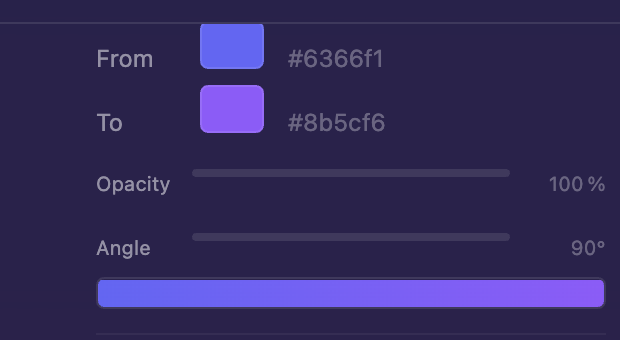
- Pick From and To colors for your gradient
- Adjust the opacity and angle
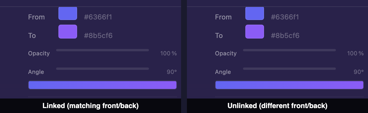
- By default, the front and back gradients are linked ��— changes to one mirror to the other. Click the chain-link icon to unlink them for independent control.
- Use the flip icon to mirror the back gradient horizontally
Adding stickers
Want to layer extra images on your card? The Stickers section lets you add up to 8 custom image stickers per card.
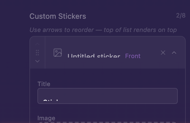
For each sticker, you can control:
- Which face it appears on (front or back)
- Its scale (20% to 200%)
- Its position using offset sliders
- Its layer order using drag handles to reorder the list
Stickers sit above all other content but below the material finish, so they look naturally "printed" on the card.