Materials, Lighting, and Effects
The right panel is where you control the look of your card and how the canvas presents it. The controls fall into four groups:
- Material — How the card surface itself looks (and the elements painted on it)
- Finish & Glow — Top-level effects applied to the card as a whole
- Lighting — How the canvas environment lights the card
- Canvas Effects — Cosmetic animations and behaviors used during preview and sharing
Understanding which control affects what is the trick to getting clean results. The video walkthrough is explicit about the difference, so the table below comes straight from there.
| Control | Affects card content (BG images, gradients, color tints, brand logo) | Affects stickers | Affects text | Baked into 3D export |
|---|---|---|---|---|
| Material preset | ✅ | ❌ | ❌ | ✅ |
| Custom material sliders | ✅ | ❌ | ❌ | ✅ |
| Finish | ✅ | ✅ | ✅ | ✅ |
| Glow | ✅ | ✅ | ✅ | ✅ |
| Edge | (the card's side trim only) | — | — | ✅ |
| Lighting | scene only | scene only | scene only | ❌ |
| Canvas Effects (drop shadow, parallax, float, spin) | scene only | scene only | scene only | ❌ |
In short:
- Material presets treat the card backgrounds and printed elements like a physical print — they don't affect the stickers or text on top
- Finish and Glow apply to the whole card, including the stickers and text in the scene
- Lighting and Canvas Effects are presentation-only — they change how the card displays on the canvas and in shared previews, but they aren't baked into the GLB export
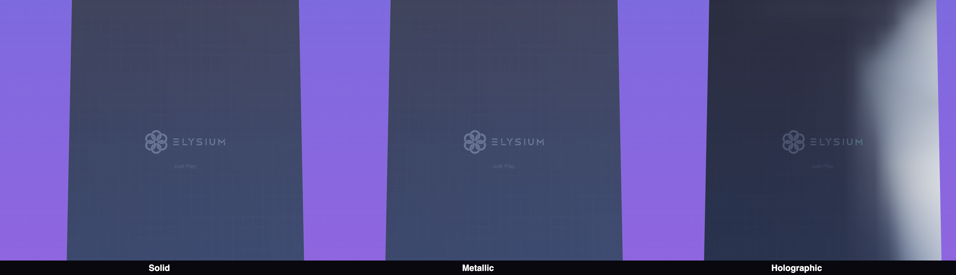
Material
The Material section controls how the surface of your card looks. Pick from six ready-made finishes:
| Finish | Best for |
|---|---|
| Flat | Uncoated cardstock look — the default |
| Holographic | Rainbow holographic trading cards — reflects the HDRI environment |
| Gold Foil | Premium gold-stamped cards |
| Matte | Soft-touch matte finish |
| Glossy | High-gloss UV-coated look |
| Frosted | Frosted / soft-gloss hybrid |
The material presets only affect the card surface — the front and back background images, gradients, color tints, and the brand logo. Stickers and text sit on top of the material and are unaffected by material presets.
Custom material
Pick Custom to manually adjust the underlying material parameters with individual sliders:
- Metalness — How metallic the surface looks
- Roughness — How sharp or diffused the reflections are
- Clearcoat — A glossy lacquer layer on top
- Iridescence — The rainbow shimmer effect
Finish (whole-card material)
The Finish sits at the top level and is applied to the entire card — including stickers and text in the scene. Think of it as a final coating that ties everything together.
A subtle Finish makes the stickers feel "printed on" rather than pasted-on. A more aggressive Finish unifies the whole card into a single shiny object.

Glow (emissive)
The Glow slider gives the card luminosity — useful for making cards "pop" in AR, where ambient lighting can be unpredictable.
The default Glow value has been tuned to look good in most scenes. You can override:
- Glow intensity — How strongly the card emits light
- Glow color — Tint the emission. Lighter shades read most naturally; saturated colors give a deliberate neon look
For AR placement, leave Glow at or near the default. Cards with too much glow can look washed out under bright real-world lighting; cards with no glow can disappear in dim rooms.
Edge
Your card has a thin edge between the front and back faces. It has its own finish and color controls so you can pick out a frame around the card.
| Edge type | What it looks like |
|---|---|
| Solid | A flat color band (pick the color) |
| Metallic | Brushed-metal look |
| Holographic | Iridescent foil look |
The edge section also exposes a set of presets (for example, Platinum, the default) so you can drop a polished edge in with a single click.

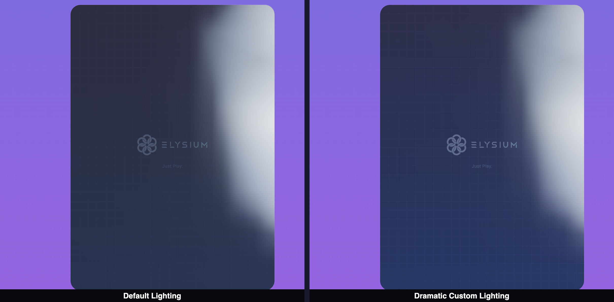
Lighting
The Lighting section controls a three-light setup on the canvas. Critically, lighting is a canvas-only setting — it changes how the card looks while you're designing it and in the share preview, but it isn't baked into the GLB export. (In ELYSIUM AR, real-world lighting takes over instead. See Saving and Exporting for details.)
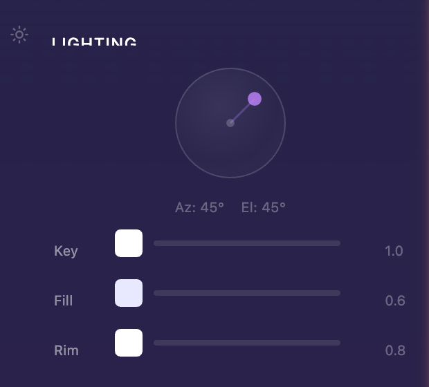
| Light | What it does |
|---|---|
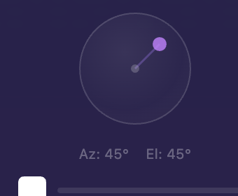
| Key Light | Your main light source. Drag the interactive direction sphere to aim it. Adjust intensity and color. |
| Fill Light | A softer secondary light that reduces harsh shadows from the key light |
| Rim Light | A back-edge light that makes the card pop against the background |
Play with intensity sliders and colors to dial in the mood. Warm key + cool fill is a classic combo; matched colors give a more graphic look.
Canvas Effects
The Canvas Effects section turns presentation-layer behaviors on and off. These run only in the designer canvas and in share previews — they are not baked into the GLB export.
Drop Shadow
Adds a soft shadow beneath the card so it looks anchored in the scene rather than floating in a void.
Light Parallax
Subtle highlight shifts as you move the cursor over the card, mimicking how real foil cards catch light when you tilt them. Especially fun on Holographic and Gold Foil materials.
Float Animation
Makes the card gently hover up and down on its own, even when no one is interacting with it. Adds life to the share preview.

Spin Animation
Rotates the card on its own axis. When viewers open a share link, this is the animation they see.
The Spin section has two sliders:
| Slider | What it does |
|---|---|
| Speed | How long a single full rotation takes (e.g., 5 seconds = one rotation every 5 s) |
| Delay | How long the card pauses between rotations (e.g., 1 s = a one-second pause after each spin) |

The spin animation is purely cosmetic — it isn't baked into the 3D asset itself. When you export a GLB, the card is static. Spin is there to give your share link a confident hero presentation.
You can also toggle spin on and off from the floating toolbar in the canvas — handy when you want to take a screenshot without the animation interfering.
Composition
The Composition section exposes a row of preset camera angles you can pick to compose your card for screenshots and shares. They are the same five presets you can switch between with the 1–5 keys (Portrait, Hero, Float, Drama, Showcase). See Getting Started for what each preset looks like.