Canvas, Backgrounds, Images, and Stickers
The left panel is where you compose the visuals of your card — the canvas environment, the front and back artwork, foreground overlays, brand logos, color tints, and stickers.
The canvas
The canvas is the 3D environment in which your card is rendered. It's also the backdrop you'll see when:
- Taking a photo / screenshot of your design
- Sharing your card online via a share link
The canvas picker in the left panel lets you choose what fills that environment.
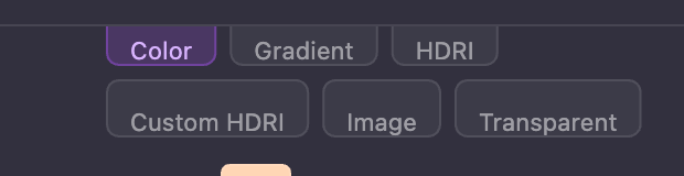
| Option | What it does |
|---|---|
| Color | A solid color with opacity control |
| Gradient | Two-color gradient with angle and opacity |
| HDRI Preset | A 360° environment image — see below |
| HDRI Custom | Drag in your own .hdr or .exr environment file |
| Image | Use any image as a flat backdrop |
| Transparent | No background (useful for clean cutouts and exports) |
HDRI environments — real-world lighting
HDRIs are 360° images that wrap around the entire scene. They serve two purposes:
- As a backdrop — Just like a regular image, they fill the canvas behind the card
- As a light source — They simulate real-world lighting, so your card reflects and is lit by the environment exactly the way it would be if you held it inside that scene
This is why a Holographic or Glossy card looks dramatically different under each HDRI — the surface is genuinely picking up the colors and angles of the environment around it.
The Card Designer ships with several presets (for example, Sunset and Forest). Some presets are intentionally low-res when used purely for lighting reference, but the lighting they cast is still accurate.
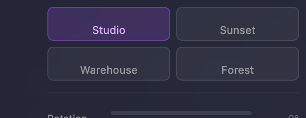
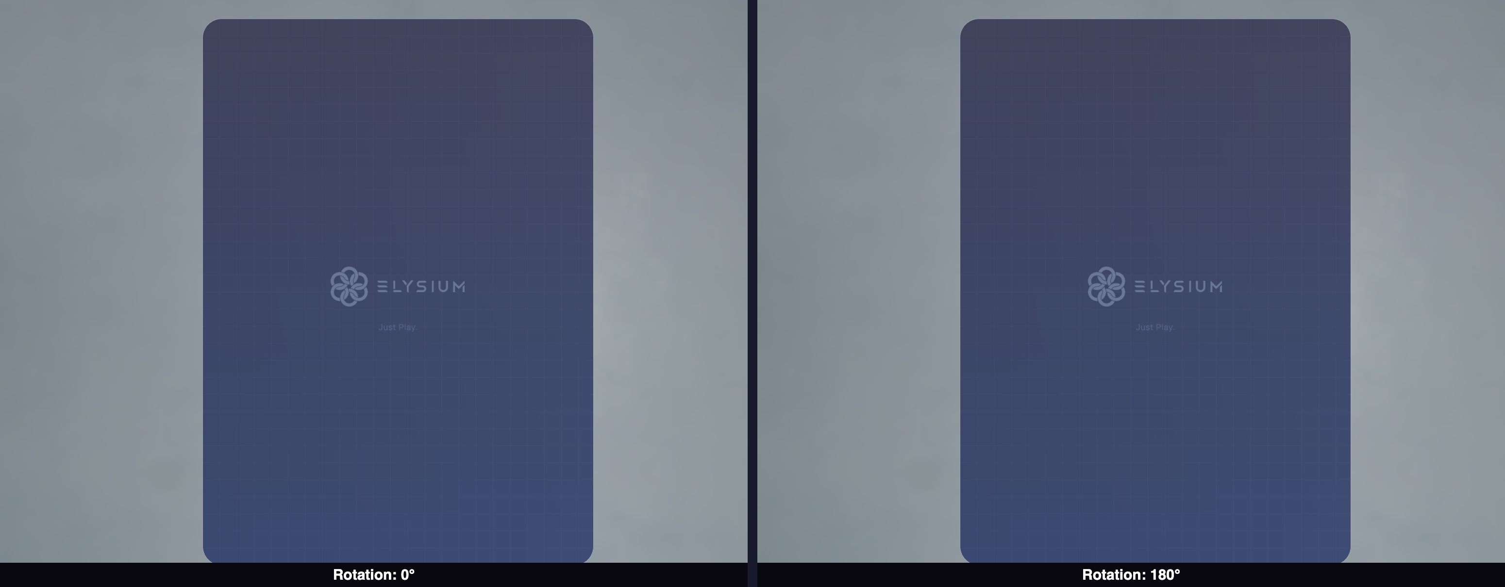
When you choose an HDRI background, a Rotation slider appears below it. Rotating the HDRI spins the entire environment around the card, which moves where the bright spots and reflections fall on your card's surface — perfect for fine-tuning a hero shot.
Custom HDRI
If you have your own .hdr or .exr file (sourced from any HDRI library online), drag and drop it into the HDRI Custom drop zone. The same rotation slider applies.

Background size
Below the canvas controls is a Background Size slider. This zooms the canvas backdrop in or out so you can frame your card nicely for screenshots and shares — for example, pulling an image background back so the card sits cleanly inside the frame, or pushing in to fill the photo with a single hero color.
The background size has no effect on the card itself; it only affects how the canvas is composed.

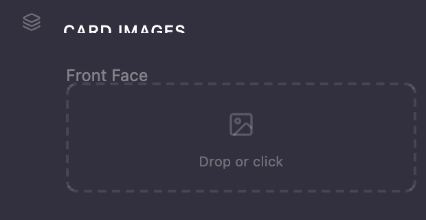
Adding images to your card
Drag and drop images directly onto the labeled drop zones in the left panel:
- Front BG — The full background image on the front face of your card
- Front FG — A foreground overlay (logo, character art, hero subject) that sits on top of the front background
- Back BG — The image for the back of your card
- Brand Logo — A small logo that anchors to the top-left corner of the card
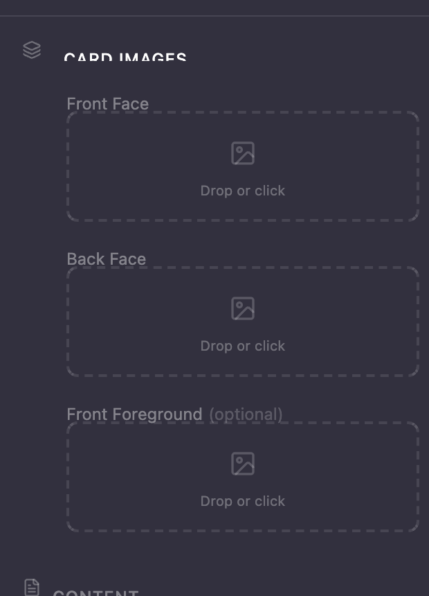
Watch for the purple highlight when dragging an image over a drop zone — that means it's ready to accept your file.
Supported formats: JPEG, PNG, WebP, and SVG (for the brand logo).
How image fitting works
Images are automatically fit to the face they're applied to. Drop a landscape image into the back-face slot and the system rescales it to cover the full portrait area — you don't need to pre-crop.
For PNGs with transparency (alpha), the transparent pixels stay transparent. This is what makes the Front FG slot useful for things like character cutouts where you want them to float over the background.
If you see a faint outline around a transparent PNG, that's an artifact of how the file was exported (the alpha edge has color bleed). Re-exporting the PNG with cleaner alpha edges will remove it.
Positioning the foreground
After uploading a foreground image, use the Offset X, Offset Y, and Scale controls to place and size it exactly where you want.

Brand logo
The Brand Logo anchors to the top-left of the card by default, sitting above the title area. SVG files are recommended because they stay crisp at every zoom level. You can scale the logo to taste.

Visibility toggles
Every image element (Front BG, Front FG, Back BG, Brand Logo, Stickers, text blocks, gradients) has a small eyeball icon next to its label. Click it to hide the element without deleting it — perfect for trying composition variations or checking layered alignment.

Color tints (gradient overlays on the card faces)
The Color section in the content editor lets you apply a colored tint on top of your front and back background images. This is a great way to unify the look of two different photos, push a brand color through your design, or add atmospheric mood.
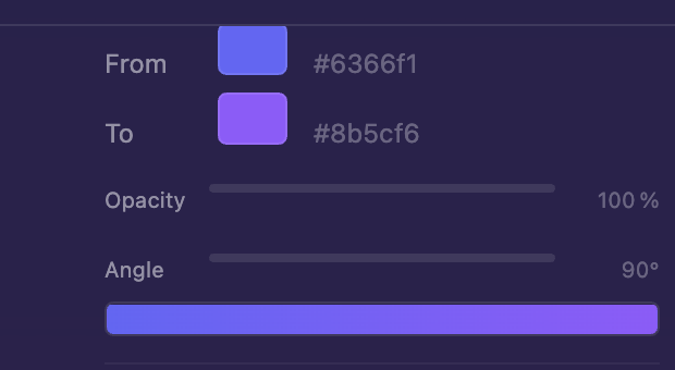
For each tint you control:
- From / To colors — The two ends of the gradient (set both to the same color for a flat tint)
- Opacity — How strong the tint is. At 100% the tint completely hides the image underneath; at lower values you blend the tint with the artwork
- Angle — Rotates the gradient around the card face
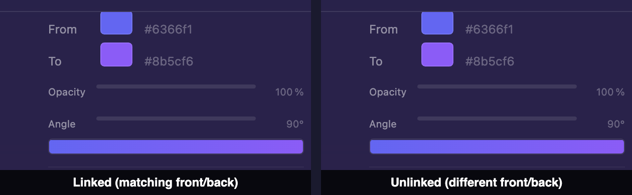
Linked vs. unlinked tints
By default the front and back tints are linked — changing one mirrors the change to the other. Click the chain-link icon to unlink them and configure independent colors, opacity, and angles for each face. There's also a flip icon to mirror the back gradient horizontally.
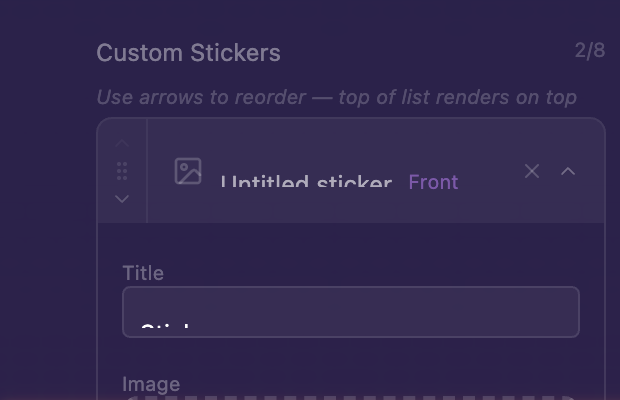
Stickers
Stickers are visual decorations you can layer on top of your card design. You can add up to 8 stickers per card, placed on either face. Stickers are great for badges, accents, and personality.
Where to find stickers
Any PNG, JPEG, or WebP works — including images with transparent backgrounds for that classic die-cut sticker look. A great free source is stickping.com, which has a large library of pre-cut sticker images you can download and drop straight into the designer.
Adding a sticker
- Click Add Sticker in the Stickers section
- Give it a title (for example, "Bacon")
- Drag and drop the image file into the slot — or directly onto the canvas — and the sticker is added immediately
Sticker controls
Stickers have one extra control that the other image elements don't: Rotation.
| Control | What it does |
|---|---|
| Face | Front or back of the card |
| Scale | Size of the sticker |
| Offset X / Y | Position on the card |
| Rotation | Spins the sticker on its center |
| Visibility | Eyeball toggle |
Layer order
Stickers stack on top of every other card element (background images, gradients, color tints, brand logo, text). They also stack on top of each other in the order they appear in the list.
To change the layer order, drag stickers up or down in the Stickers list — stickers higher in the list render on top of stickers lower in the list. This is how you put a small accent on top of a larger one.

Stickers always render on top of the card's surface, beneath the Finish material. That gives them a "printed-on" look while still picking up the card's overall finish.