Card Content
The left panel's content editor is where you set up everything that's specific to your card: project-level typography, the text that appears on each face, card-type-specific metadata, audio, and AR action buttons.
The fields you see depend on which card type you picked during setup (AR Card or Loyalty Card), but the typography, text editor, and audio sections work the same for both.
Project fonts (Card Details)
The Card Details section sits at the top of the content editor and defines the two project-level fonts that the rest of the card draws from.
| Font | What it controls |
|---|---|
| Primary font | The default font for your card title and any text block flagged with the "primary font" toggle |
| Secondary font | A complementary font available alongside the primary |
Both fonts are picked from a curated list of web-safe and brand-friendly options. They're optional — if you don't pick anything, the card uses sensible defaults.

Pick your project fonts before you start adding text. Each text block can override the project fonts on its own, so the project picks act as the default rather than a hard rule.
Card title and the "T" toggle
The card title (the name you gave your card during setup) is rendered on the card face by default. Two small controls live next to it:
- Visibility (eyeball) — Show or hide the card title without deleting it. Useful when your brand logo already includes the title, so the rendered text would be redundant.
- Primary-font toggle (the "T" icon) — When on, the title uses the project's primary font. When off, it falls back to a generic default font.
You can also adjust the size of the card title to match your composition.

Text content (HTML blocks)
Each card face supports two text blocks: a primary HTML block and a secondary HTML block. That gives you up to four blocks total across the front and back:
- HTML Front — Primary text on the front face
- HTML Back — Primary text on the back face
- Secondary HTML Front — A second block on the front face
- Secondary HTML Back — A second block on the back face
Each block is fully independent — you don't have to fill all four in.
The text editor
When you tap into a text block, an inline editor appears with the controls you'd expect from a rich text tool:
| Control | What it does |
|---|---|
| Font picker | Pick any web font for this block (overrides the project font) |
| Bold / Italic / Underline | Standard inline formatting |
| Color | Set the color of the selected text |
| Font size | Adjust the text size |
| Line height | Adjust the spacing between lines |
| Width | Constrain the block's width — wider blocks fill more of the card; narrower blocks force wrapping |
| Position (X / Y) | Drag the block on the card to place it exactly where you want |

Editing tips
- Mix-and-match formatting: select a single word and bold or color just that word — the rest of the block keeps its base formatting
- The width slider is what makes a long line wrap into multiple lines on smaller cards
- Use position to layout text around a foreground image (for example, putting a subtitle below your hero character)
- Both blocks have eyeball visibility toggles so you can hide them temporarily

Behind the scenes the editor produces simple HTML, so a future copy-paste workflow between cards is straightforward.
AR Card content
When you've selected AR Card as your card type, the content editor exposes a set of AR-specific fields:
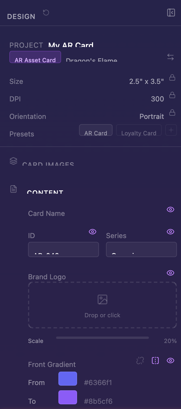
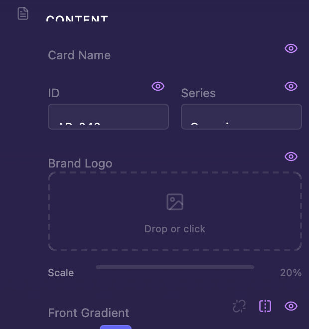
Card metadata
These fields tell ELYSIUM how your card relates to other cards in the same project. Some are printed on the card; others are stored as metadata for use in worlds and gamification later.
| Field | Printed on card? | What it's for |
|---|---|---|
| Card ID | Yes | A unique number for this card (e.g., 001) — useful when a project has many cards |
| Series | Yes | The series name this card belongs to (e.g., New World) |
| Collection | No (metadata) | Used by ELYSIUM worlds to group related cards together |
| Edition Size | No (metadata) | How many copies of this card exist in your account |
The idea is that a project can hold an entire series of cards (think of a 52-card deck). The Card ID and Series fields let viewers see where a given card sits within that series, while Collection and Edition Size are reserved for the gamification layer that ELYSIUM will use as it grows.
You don't need to fill in Collection or Edition Size for a one-off card. They're there for when you want to use ELYSIUM's collectibles features down the road.
AR Buttons
Up to 4 interactive buttons can be placed around the card (top, right, bottom, left). Each button has an action that fires when a viewer taps it — for example, opening a link, triggering an AR trace, dismissing an overlay, or flipping the card.
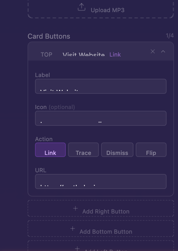
AR Buttons are reserved for ELYSIUM's AR runtime — they configure interactions that fire when the card is loaded inside an AR scene. You don't need to configure them to design and share the card; leave them at defaults if you're just building the visuals.
Visibility toggles
Every element in the AR content editor has an eyeball icon next to it. Click to show or hide without deleting the configured value.
Loyalty Card content
When you've selected Loyalty Card, the content editor swaps in fields tailored to a loyalty / membership program:
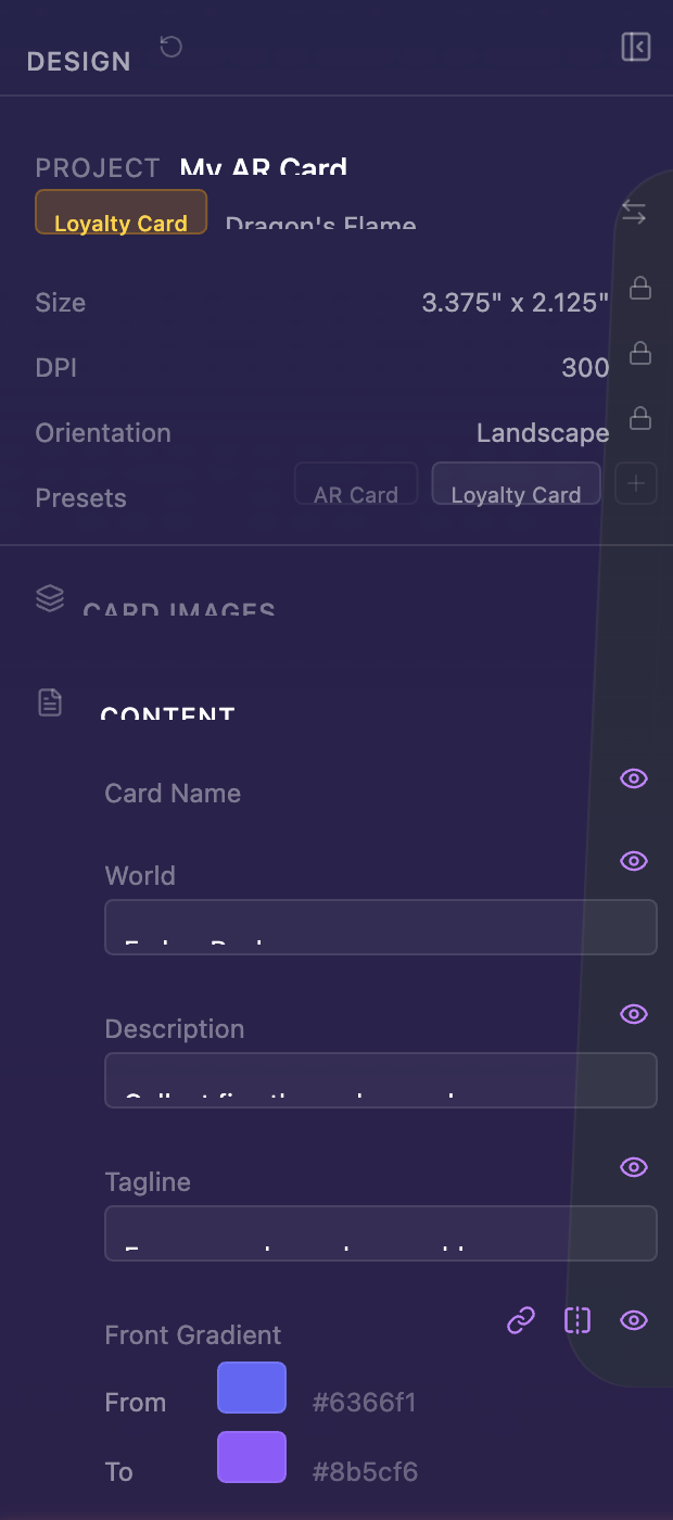
| Field | What it's for |
|---|---|
| World name | The brand or world this loyalty card belongs to |
| Description | A short explanation of the loyalty program |
| Tagline | A snappy line that anchors the card visually |
| Brand logo | Logo with adjustable scale |
| QR code | Drag in a QR image (e.g., a member URL) |
| Barcode | Drag in a barcode image |
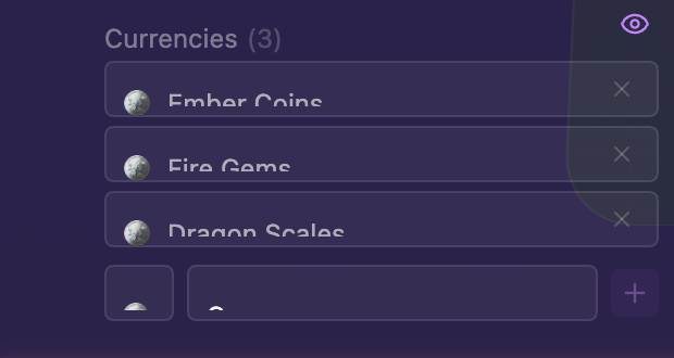
| Currency denominations | Up to 10 custom currencies (e.g., 100 LUMEN, 5 ORBS) |
Switching card types after you've started filling in content is non-destructive — the same images, gradients, fonts, and stickers carry over. Only the type-specific fields change.
Audio
Both card types support a single Audio track that plays when someone previews or shares your card. The audio has no effect on the card visuals — it's purely for atmosphere.
To add audio:
- Open the Audio section in the content editor
- Drag in an MP3 file (or click to browse)
- Use the inline preview to hear it back
The audio plays automatically when:
- You enter the Fullscreen Preview in the designer
- A viewer opens your Share link
- A viewer opens the Share Preview (the in-designer dry-run preview)

Pick something short and atmospheric — most viewers will only listen for a few seconds. Audio that loops cleanly works best.